Using a Canopy Application
Let’s visit PolyAPI’s UI and get familiar with a Canopy application! Navigate to the following path on your instance:
/canopy/polyui/login
For example, on na1, the path would be:
https://na1.polyapi.io/canopy/polyui/login
Log in using your API key.
Note
Ensure you have the necessary permissions “Use Applications”.
Contact your tenant admin or support@polyapi.io for permissions assistance.
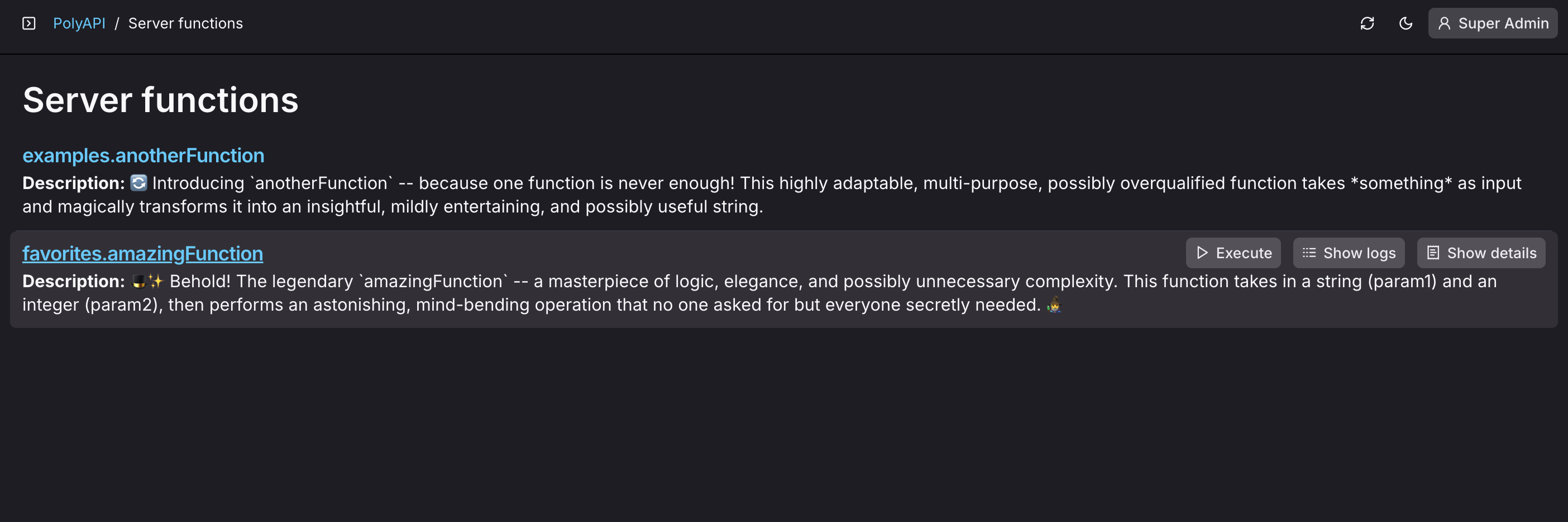
Once logged in, you’ll see PolyAPI’s UI Canopy application, something like this:

Canopy Application Anatomy
Canopy is designed to generate structured UIs that enhance usability and efficiency. Below are the key elements that define the anatomy of a Canopy application along with a break down of collections within PolyAPI’s Canopy application:
Main Content Area
The right-hand panel is dynamic and updates based on the selected item in the sidebar. It follows a structured workflow:
Selecting an Item from the Left Navigation
Selecting a collection (e.g., Server Functions) loads a list of available resources within that collection.
Depending on the application’s configuration, there may be a “Create” or “Add” button available to add new resources.
Hovering for Quick Actions
When hovering over an item in the list, quick action buttons may appear.
Action buttons are determined based on the application’s config file for each collection.
These actions may include things like Execute, Show Logs, Show Details, or other relevant options for a given resource.
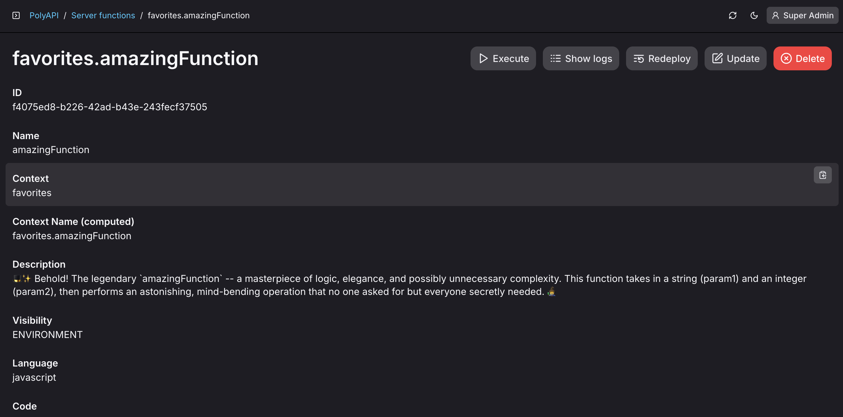
Opening a Detail Page
Clicking on a list item opens a detailed view for that resource.
The detail page provides more in-depth information and available actions.
Actions may include CRUD operations like “Update” and “Delete” along with other collection specific options like “Show logs”, “Execute”, etc.
Header Bar
The top bar provides session controls and workflow enhancements:
Breadcrumb Navigation: Displays the current path within a Canopy application, allowing easy navigation back to previous sections.
Refresh & Sync Button: Refreshes the current view to ensure the latest real-time data is displayed.
Display Mode Button: Toggle between Light, Dark, or System modes.
User Profile & Permissions Button: located on the far right, click to open your profile detail page.

Conclusion
By leveraging these structured elements, the Canopy application streamlines the process of developing, configuring, and managing PolyAPI components efficiently. Now that you’re familiar with a Canopy application, let’s explore how to Create a Canopy UI Application from within PolyAPI’s UI!